Five Why’s Analysis
LinkedIn users appear to be very apprehensive at the idea of having their data be shared without their knowledge, which motivated them to check the settings Both participants mentioned that they didn’t want their data to be used for purposes outside of what they would willingly consent to.
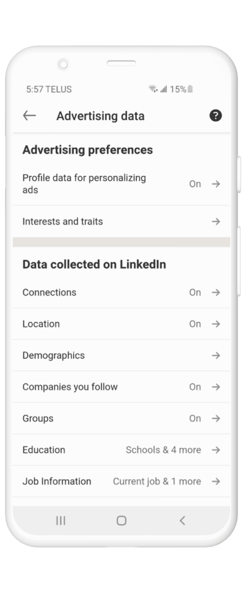
Noted that “relevant ads” contains “job ads”. Due to fear of missing out on jobs, they keep the option on, but feel taken advantage of
Don’t want to share data with companies they don’t morally align with
“I value my privacy, and lately I’m becoming aware of how data can be used for nefarious purposes.”

Userflow
Confusing titles
There are two options presented at this screen: “Data Privacy” and “Advertising Data”. These can be combined to reduce confusion
Redundant pages
In the original flow, the user needs to open a new page to control their settings, which adds friction to their experience. It would be optimal to find a way to toggle settings without opening a new page
Information Overload
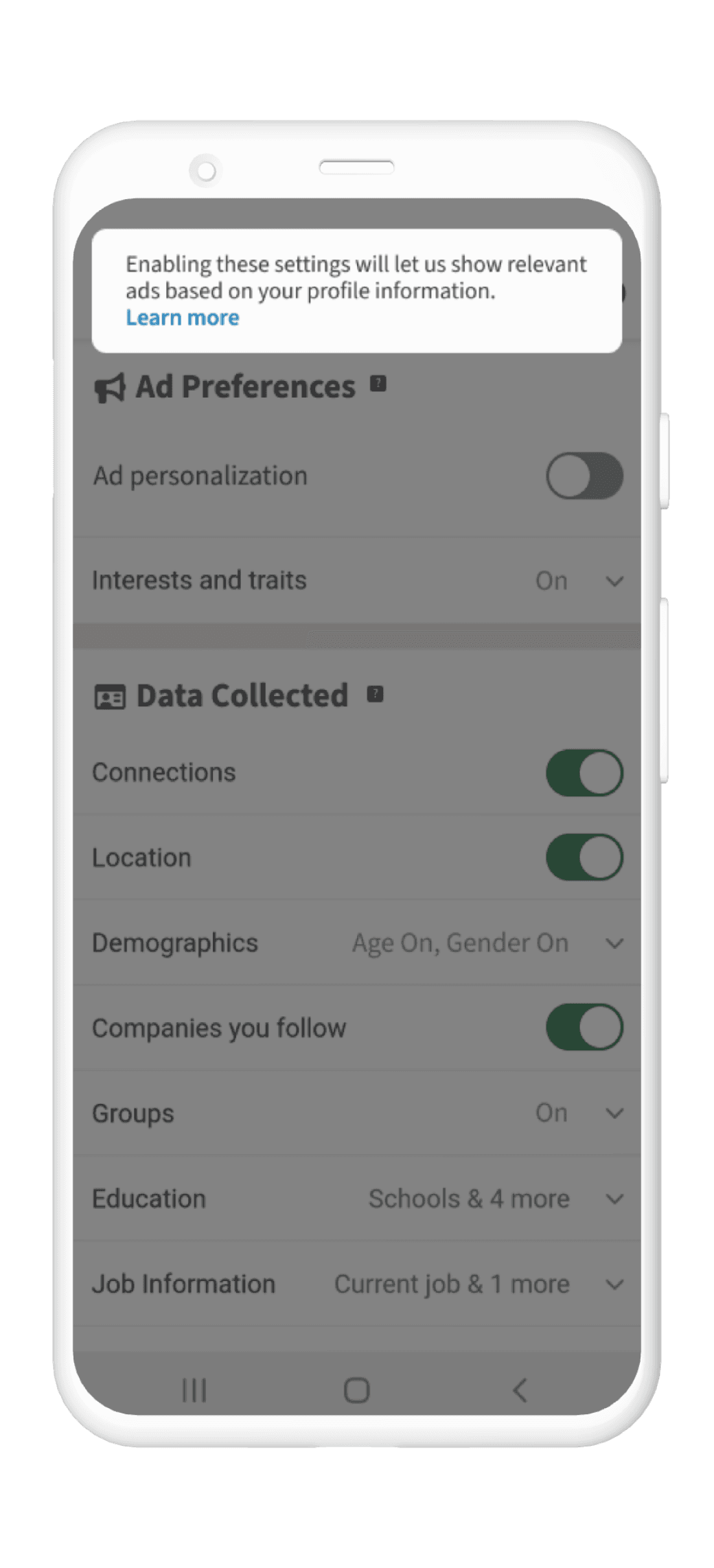
Additional information is provided on the get-go, which adds extra cognitive load on the user. Giving the user an option to “see more” can help lessen the load
Insights Gleaned
Here were the insights that are gathered from the research:
Guerrilla Usability Testing was used to explore 5 different design solutions. The participant recruited for this test was tasked to turn off ad personalization.

Visual Development
Linkedin’s brand guidelines were also referred to as this project progressed. Colour, typography, along with line-height was in accordance to Linkedin’s brand guidelines.
Low-fi Prototype
To visualize the layout of the solution based on the result of the Guerrilla Usability Test, I created a low-fi prototype.
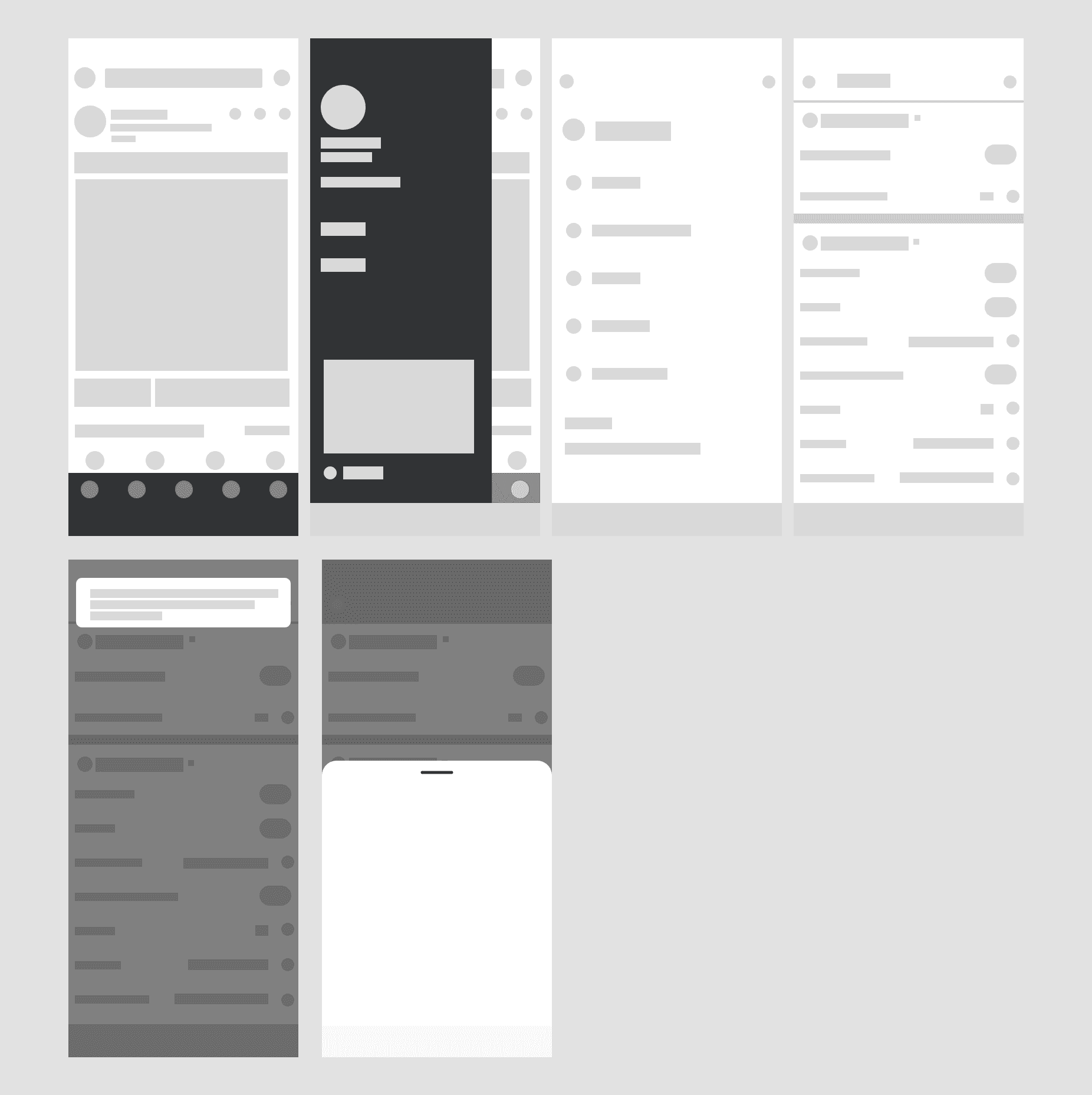
Mid-fi Prototype
After creating the low-fi prototype, I further developed on the solution by creating a mid-fi prototype by adding visual elements and typography.

Original Design
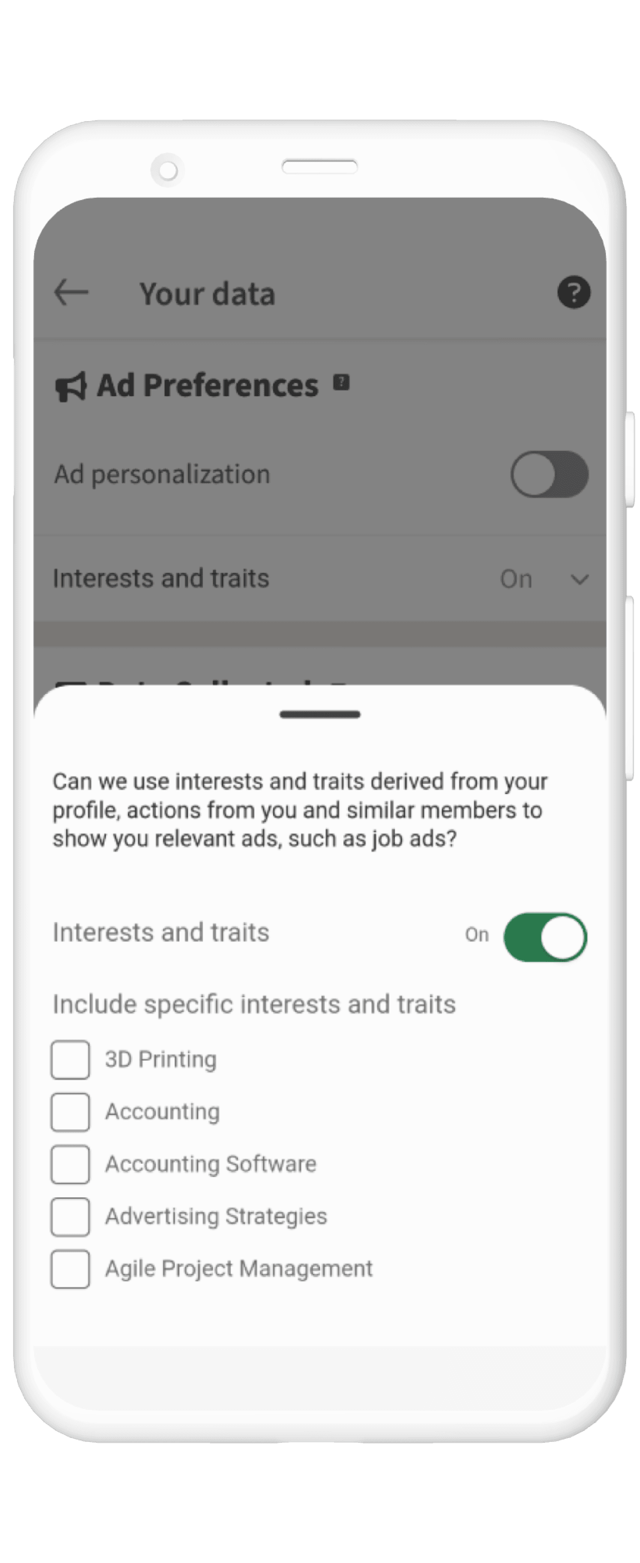
Here is a walkthrough of LinkedIn’s original design.
Final Design
From the mid-fi prototype along with research-backed insights, I’ve redesigned and prototyped a hi-fidelity prototype. Colours were added based on LinkedIn’s branding guidelines to establish consistency.
User testing is key
The importance of user testing was key when designing for better data transparency, as it gave a better glimpse as to how LinkedIn users use the app, which better informed my design choices. Throughout the various user tests conducted, I gained insight into motivations I wouldn’t have thought of otherwise, such as users only wanting to share data with companies that they morally aligned with.
Designing for a brand
This experience provided me an opportunity to design with an existing branding guideline, which meant I had to ensure the spacing, colour and typography were consistent with LinkedIn’s brand. This opportunity helped me grow as a designer and allows me to be better equipped to work with design systems in the future.
Thanks for reading!
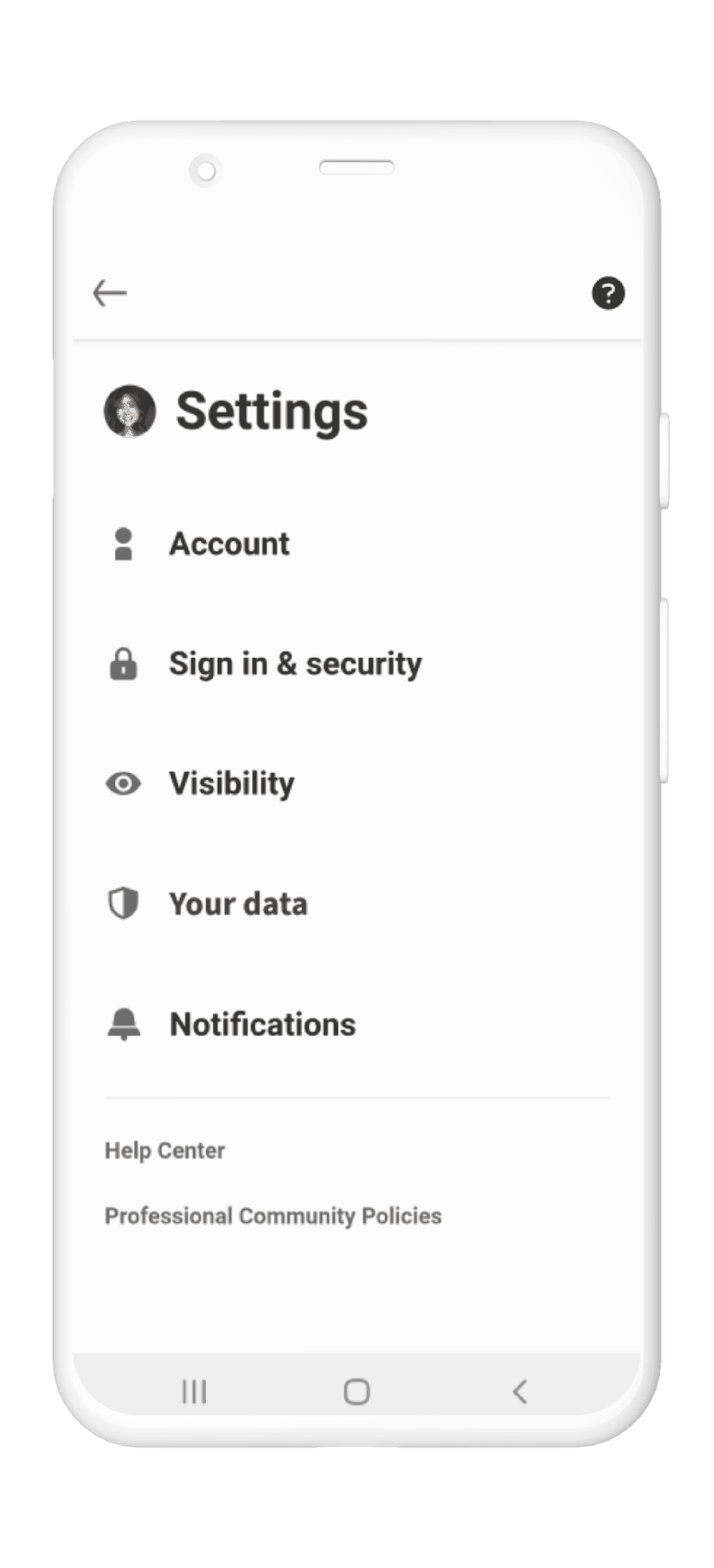
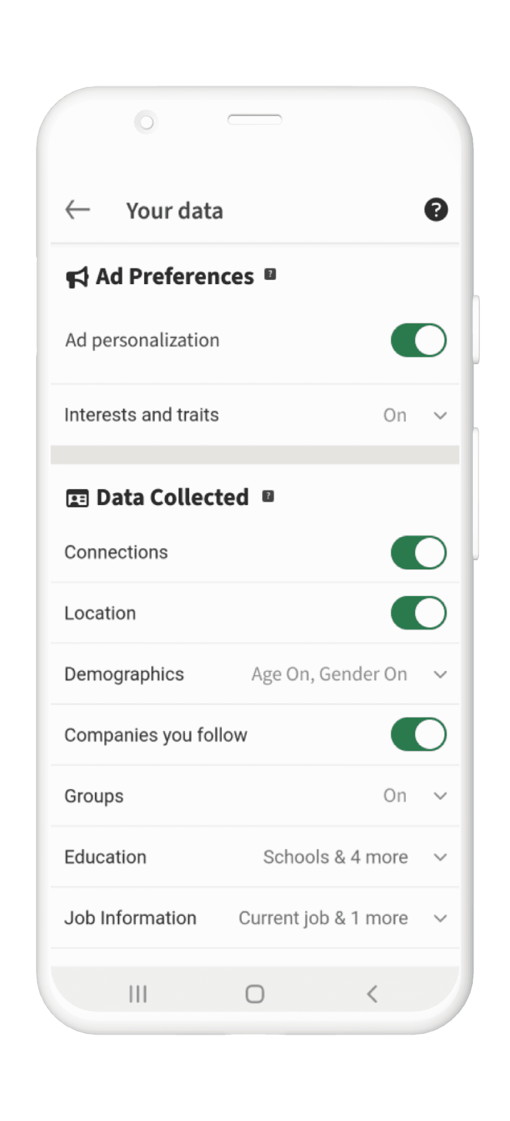

When the user encounters the settings page, they are presented with an option named “Your data”. This setting contains LinkedIn’s previous categories of “Data privacy” and “Advertising data”, merged into one.
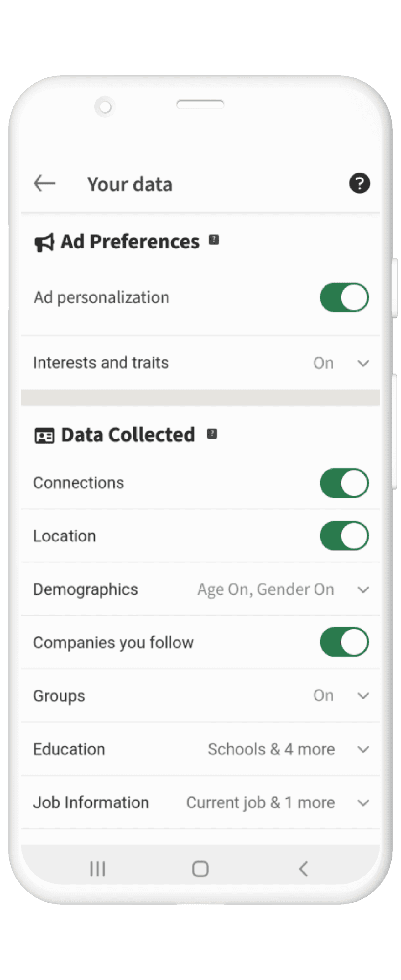
Rather than the toggle being only presented after a new page is open, it is instead shown on the same page to reduce unnecessary clicks and load times.
To ensure transparency, the user can access more information about different settings through clicking on the information icon.

For any settings that were more complex, rather than opening a new page, a drop down menu was added to reduce clicks.